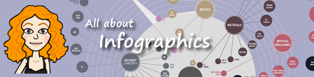
Types of Infographics
There are many types of infographics and each are consumed differently. The right kind of infographic should match your data to your narrative and ensure that people take away your message after reading it. Below is a list of the most popular types of infographics used today along with some examples. Click the thumbnail images below to view the examples in their larger, original format.
Advocacy - This type is used to outline issues and problems with a call of action to invite others to help fix the problem. They help to explain a complex social problem or a solution.
Childhood Hunger (Schloesser, 2011) |
The Truth About Eating Animals |
You've Earned A Say: |


How To - How to infographics are process-oriented in that they take you through a process step-by-step. They are used to answer a question or explain something by visually showing how to do it.
Paddling Guide for Dummies: |
How To Twitter |
How to Make Gingerbread Cookies |


Flowchart - This type is used to give readers different choices in order to help them reach the answer to a specific question.
How Our Laws Are Made |
Paleo Diet Flowchart |
RPG Story Flowchart |


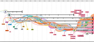
Timeline - "Timelines infographics visually represent a sequence of events that happen over time, allowing the user to understand the visualized data quickly and effectively. Also referred to as chronological infographics or tabular infographics." (Infographing Design, 2013) Of the examples shown below, "The evolution of the web is an awesome visual timeline of web technologies and browsers from 1990 to the present. The Google team created the interactive infographic using HTML5 and Google’s App Engine in honor of Chrome’s third birthday. Click on any of the browser lines—from Mosaic to Chrome OS—to see screenshots of their various release versions. (Seeing Netscape 4 again sure does take me back.) If any of the technologies (in boxes with colorful trails) are unfamiliar to you, you can click through to go to their Wikipedia pages." (Gdobush, 2011)
Video Game Timeline |
History of the Earth Timeline |
Evolution of the Web Interactive Timeline |


Tips or Demos - This type is used to convey general information or best practices, useful to target audiences, starting with the first five.
5 Food Safety Tips for Summer Grilling |
5 Ways To Amp Up Engagement On Your Facebook Page |
5 Tips To Prevent Lost Pups |


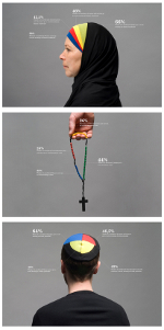
Compare and Contrast - This vs. That! These types are used for head-to-head comparisons of two or more products, ideas, philosophies, and so on, to help the viewer visually see their differences.
Comparing the Growth of U.S. Family Incomes |
Does One Have To Win? Books vs E-Books |
Teaching & Learning |


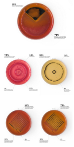
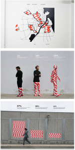
Photo - This type is used to help the viewer visualize content or understand a story.
Interest No.4: Refugees and Immigrants |
Interest No. 5: Health and Healthcare |
Interest No. 6: Law and Order |
Visual Article - Did you know? - This type is used to create fact sheets by compiling information of interesting data from research studies or to create a visual of a lengthly peice of writing..
50 Facts About Rainforests |
Components of a 21st Century Classroom |
Waste Facts |


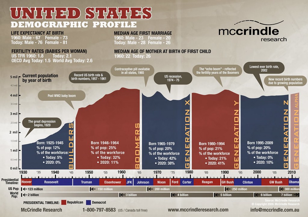
Demographics - Businesses use this type to when doing market research.
Student Demographics |
United States Demographic Profile |
Downtown LA Demographic Study 2011 |


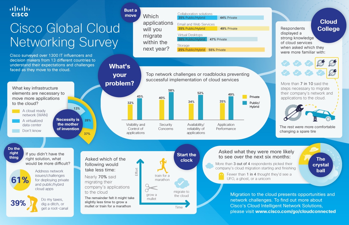
Research Results - These types show the results of a study or survey.
Stress At Work |
Offers On Mobile: The US Survey |
Cisco Cloud Global Networking Survey |


Data Visualization - This type is used to turn lots of data into a visual work of art.
20th Century Death: Selected Major Causes |
At Atlas of Pollution: |
Iraq: 10 Years since the Invasion |


Maps - This type is used to to represent geographical data.
United States Football Map |
Smallpox Origin |
Where the Minerals Are |


